|
[Low altitude winds]

[High altitude winds]

|
|
[Low altitude winds]

[High altitude winds]

|
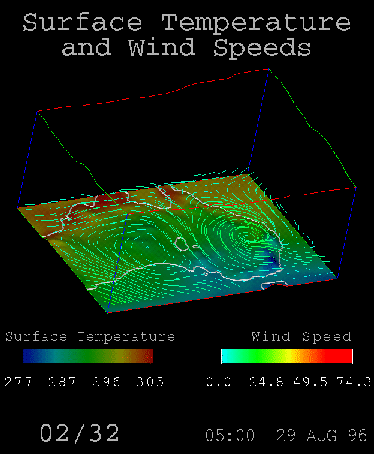
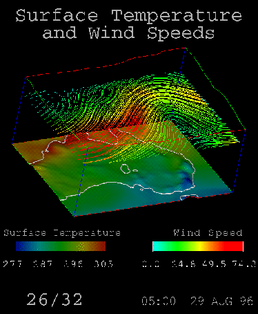
The visualisation takes streamlines in successive horizontal slice planes, starting at ground level and working their way up. This gives the viewer the impression of how the winds would vary if, for example, they were observing them5 in a airplane which was rising.
The most notable features are that the winds at higher altitudes are stronger and more concentrated, and the jetstream is clearly visible.
The surface temperature is also visualised in the same manner as in previous visualisations. This was done in the hope that some correlation between the high altitude winds and the surface temperature. None appear obvious, but a more trained eye may be able to distinguish some.
In addition, 32 slice planes were taken in the animation, yet the data contains
only 16 horizontal slice planes in the ![]() direction. 16 slice planes in
the animation were not enough to make it smoothly flowing, so to compensate
for this the streamlines were interpolated between slice planes using a Runge-Kutta
method. This is a good approximation technique and gives a smooth animation.
direction. 16 slice planes in
the animation were not enough to make it smoothly flowing, so to compensate
for this the streamlines were interpolated between slice planes using a Runge-Kutta
method. This is a good approximation technique and gives a smooth animation.